Frequency distributions
Stem-and-leaf Diagrams
Histograms
Arithmetic Mean
Median and Fractiles
Box-and-whisker Plots
Mode and Midrange
Grouped Data
Range
Imagine an microorganism that divides every 5 minutes, and, when exposed to a mutagen, its DNA sequence can change over time. As a biologist, you may be interested in determining if certain genes mutate more than others. Examining this organism, whose population is growing exponentially, for only a few hours would produce a large amount of data. Simply looking at the long list of data would not yield much success, the data must be organized in some manner. We can use frequency distributions to do this.
A frequency distribution organizes the data into classes. Each class represents an interval of values in the data set. Ideally, these intervals are all of the same size, which is the class interval. However, sometimes you will see intervals of different sizes, or even intervals that are missing one boundary. The class boundaries are values that separate different classes of data. This boundaries should be numbers that have more significant digits than the numbers in the data set. For example, we are using numbers of mutations as our classes then the digits are significant at the units place (i.e., 1, 2, 3, ). Good class boundaries would be significant to the tenths place (i.e., 1.5, 2.5, 3.5, ). Using this rule one will have all the data fit into one and only one class. When a class is missing a boundary it is referred to as an open class. Open classes can occur at either end of the distribution (i.e., less than or equal to 1.4, 1.5 to 2.4, 3.5 or greater). Although there is nothing intrinsically wrong with using frequency distributions with open classes to summarize data, open classes do make certain types of data analysis impossible and some types of visualization difficult. In later lectures, we will discuss some of these methods, and you will see why open classes can be a problem. One final attribute of a frequency distribution is the class mark, which identifies the midpoint in a class. You can find the midpoint by adding the lower limit and upper limit and dividing by 2, e.g., (1.5-2.5) / 2 = 2.0.
When producing a frequency distribution, we place data into appropriate classes and tally the numbers. This type of manipulation allows one to rapidly see attributes of the data such as midpoint and range readily. Taking the example of the mutations again, we may see for 10 loci the following frequency distribution of mutations in 100 cells:
| Class (Locus) |
Frequency (Number of Mutations) |
|---|---|
| 1 | 1 |
| 2 | 5 |
| 3 | 7 |
| 4 | 12 |
| 5 | 22 |
| 6 | 26 |
| 7 | 11 |
| 8 | 9 |
| 9 | 4 |
| 10 | 3 |
Additionally, we may wish to visually compare two frequency distributions to see if they are similar. If different sample sizes are used, then this will not be a very fruitful exercise when simply using the numbers in each class. In such cases, it is better to use percentages in each class. To get the percentage we simply divide the number in a class by the total number. For your mutation example we get:
| Class (Locus) |
Frequency (Number of Mutations) |
Percentage (%) |
|---|---|---|
| 1 | 1 | 1% |
| 2 | 5 | 5% |
| 3 | 7 | 7% |
| 4 | 12 | 12% |
| 5 | 22 | 22% |
| 6 | 26 | 26% |
| 7 | 11 | 11% |
| 8 | 9 | 9% |
| 9 | 4 | 4% |
| 10 | 3 | 3% |
These data can now be compared to those for 1000 cells or any other sample size.
As you can readily see, most of the mutations are occurring at the sixth locus. Of course, the problem is getting the raw data into the frequency distribution. One way to do this is to sort all the data into ascending order and tallying it up. With large data sets this can be quite tedious without the assistance of a computer. Another way involves stem and leaf diagrams.
Steam -and-leaf diagrams are a simple way of organizing data, and they can facilitate the making of frequency distributions. They don't work for all types of data, however. They are designed for use with quantitative data (numeric) and not qualitative data (like categories). Although we used numbers to represent our loci in the above example, we could have used letters just as easily, but qualitative data is not subject to arithmetic manipulations.
A quantitative data set might be the amount of time it takes baby raccoons to find their first meal after weaning. We could collect this data on 20 raccoons and organize it with a stem and leaf diagram. We start by visually inspecting the data to get a ballpark estimate of the largest and smallest numbers. In this example we will use 20 minutes for the shortest time and 120 minutes for the longest. We can use the tens place to represent categories that we wish to group data on. That would give us a column like this
| Tens of Minutes |
|---|
| 2| |
| 3| |
| 4| |
| 5| |
| 6| |
| 7| |
| 8| |
| 9| |
| 10| |
| 11| |
| 12| |
In this column the 2 represents 20 minutes and the 12 represents 120 minutes. Now we can search through all the data and simply place the numbers in the appropriate rows without performing any sorting. A number like 23 can be represented in the "2" row with a 3, and 118 can be represented in the "11" row by a 8. Once this is done for our 20 raccoons we get the following diagram.
| Tens of Minutes | Minutes |
| 2| | 3 |
| 3| | 1 |
| 4| | 2 5 |
| 5| | 1 2 7 |
| 6| | 1 1 4 8 9 |
| 7| | 3 5 5 |
| 8| | 2 9 |
| 9| | 4 |
| 10| | |
| 11| | 8 |
| 12| | 0 |
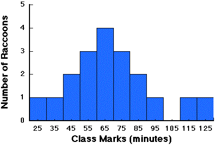
Now we can easily construct a frequency distribution using the tens as class boundaries, or we can use this stem and leaf diagram to construct new ones that have different class boundaries. Most of the information that was in the original data is represented in this diagram, and it is very easy to construct. In addition to its ease of use, it is very flexible. If you find that your original guess regarding the minimum and maximum values was off, you can add rows to the top and bottom. The frequency distribution for these data would be:
| Class Marks | Number of Raccoons |
| 25 | 1 |
| 35 | 1 |
| 45 | 2 |
| 55 | 3 |
| 65 | 4 |
| 75 | 3 |
| 85 | 2 |
| 95 | 1 |
| 105 | 0 |
| 115 | 1 |
| 125 | 1 |
Histograms are a graphical way of displaying frequency distributions. One simply uses bars to represent each class and the height of the bar indicates the number of observations (or percentage of the total number of observations). The histogram for our raccoon data would look like this:
Histograms are very easy to make with a pencil, ruler and some graphing paper. One can make much more complicated graphs with modern computers, but they really don't convey any more information to the viewer than these simple charts do.
There are many types of distributions that can describe data or populations. We will discuss many of these later in the class, but for now we need to recognize that there are also quantitative means of describing distributions as well. A distribution has properties that we can describe mathematically, and we call these the moments of the distribution. The first moment is a measure of central tendency (commonly called the mean). The second moment is the dispersion (or variance). In the next few lectures we will discuss these moments of distributions, which are simple descriptive statistics. Some of the other moments include skewness (more observations on one side of the center than the other) and kurtosis (relatively flat or peaked distributions). These last two descriptive statistics are best understood when compared to a theoretically based distribution, which we will do in later lectures.
The statistical definitions for populations may be somewhat different than you use in normal terminology. A population is the set of all possible observations while a sample is only a subset of these observations. A population may be all the genes in a single organism and the sample could be the genes that a researcher decides to sequence. If we limit our inferences only to this one individual then, from the statistical point of view, these are potentially valid uses of the terminology. However, if we decide to infer about genes in all individuals of the same species as the one used in the study, our population is really only a sample itself. So, unlike the use of these terms in normal conversation, their valid use in statistics depends on the question at hand. We will discuss populations and samples in more detail later, but for now we need to understand how one can describe them.
Observations on populations can be tallied in a form that results in a frequency distribution, as we discussed in the last lecture. A good sample taken from the population should adequately reflect that distribution. We have several ways to describe the distribution of a population and a sample in a more quantitative manner. As we shall see in later lectures, these quantitative descriptions also allow us to make inferences about distributions (and hence populations). We start the quantitative descriptions with measures of central tendency. Central tendency is a measure of the middle of the data and it can be estimated in several ways.
The arithmetic mean (or average) is simply the sum of all observed values divided by the number of observations. There is, however, more than one type of mean, and we will discuss those in the next topic.
Although we could use the harmonic mean is observations are extremely variable, this statistic is usually reserved for cyclic or regularly repeating data. When we have observations that have a few large or small values we generally use the median:
To obtain the median the data must be sorted in ascending order. The median is the middle value of the sorted values (if there is an odd number) or the mean of the middle two (if n is even). There is no formula for the median, but we do have a formula for the median position: (n + 1)/2. In the case where the sample size is odd, then the median value can be given by: xn + 1/2. We avoid the use of such a formulation, however, because it can be misleading: the median (as are all statistics) is a property of the sample of population and not of any single value. We cannot say that a particular observation is the median, even if it happens to equal the median. A population can also have a median if it is of finite size, and we denote this parameter with the following symbol:
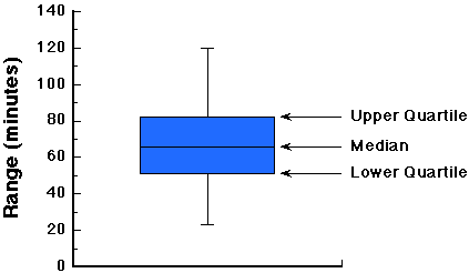
Like the mean, the median always exists and it is unique. The median is simply one of a class of statistics (or parameters) called fractiles. Fractiles divide a distribution into equal parts. Some commonly used fractiles are quartiles (four parts), deciles (10 parts) and percentiles (100 parts). When using quartiles we have three statistics, the lower quartile (Q1), the median (Q2) and the upper quartile (Q3). The lower quartiles and upper quartiles are determined exactly as the median is, except they use a portion of the observations. The lower quartiles use the data from the smallest value up to (but excluding) the median, and the upper quartile uses the data from (but excluding) the median up to the largest value. Although the upper and lower quartiles don't describe central tendency, they can be used to obtain the midquartile (Q1 + Q3 )/2, which does.
Just as histograms give a means to visualize frequency distributions, Box and Whisker Plots also allow us to visualize the central tendency and dispersion of data. In these plots we use a vertical line to represent the median, we draw a box around the region from the lower to upper quartiles (i.e., enclosing 50% of the total data), and extend horizontal lines to the lower and upper most values. Here is how a box plot of the raccoon data would look:
Another measure of central tendency is the mode, or the most common observation in the data. The mode requires not calculation and can be obtained for qualitative data, but unlike the mean and median it doesn't necessarily exist nor is it necessarily unique.
The midrange is the average of the lowest and highest observation. This statistic is rarely used as a descriptor of central tendency because it can be quite misleading in some situations. For example, a sample may have one extremely large or small value that leads to a large range (difference between largest and smallest value). Under such a situation you may be mislead to believe the center of the distribution is higher or lower than it really is. The median would be a better estimate of the center of the distribution.
When we construct a frequency distribution we can lose some information, but it is still possible to determine the mean of the data. Each class mark represents the median of the class:
and each class has a frequency (fi). The arithmetic mean of the classes can be approximated by:

where k is the number of classes. Similarly, one can approximate the median from the frequency distribution: it is the class mark of the class whose cumulative frequency is half the observations. An improved approximation can be obtained from:
where L is the lower boundary of the class containing the median, f is the class frequency, c is the class interval and j is the number of observations in the class that we need to obtain half the total number (n /2). Obviously, if you have the original data it would be easier to calculate the median by the normal means that to use this formula, but sometimes you will only be presented with the histogram of a data set. Finally, the mode can be approximated by the class mark of the most frequent class.
To see how close the approximations may be, examine the data below, together with the accompanying frequency distribution:
|
Class Mark (x ) |
Frequency (f ) |
Product (x *f ) |
|---|---|---|
|
|
|
|
Using the class data, the mean is estimated as 1370/20 = 68.5, the median = 65, and the mode (the most frequent class value) also = 65.
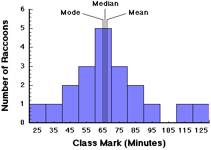
The true values of the mean, median, and mode for the entire data set (see above figure) are 67.5, 66, and 65, respectively. The difference between the real statistics and those from the grouped data are called the grouping errors. In this case they are very small. As we will see later, the grouping error depends on the type of distribution.
We have already mentioned the range of observation, and this is the simplest of the statistics of dispersion. Dispersion is a measure of how variable data are, and it stands to reason that the difference between the maximum and minimum value will give the statistician some idea about this property of a distribution. However, the usefulness of ranges is limited because it indicates nothing about the variability of the observations between the extremes. Other types of ranges suffer similar problems. Some of the more common ranges are the quartile range, which is Q3-Q1, and the quartile deviation (half the quartile range).